Google Weather
One weather system for every screen Google makes.

Project Overview
Google's weather icons were outdated and inconsistent. The root cause was structural: individual teams had drawn their own sets at different times, for their own surfaces, with no shared system underneath.
So the weather looked different depending on whether you were in Search, News, Android, or Home. And the sets couldn't represent the full range of conditions, which blocked new features instead of enabling them.

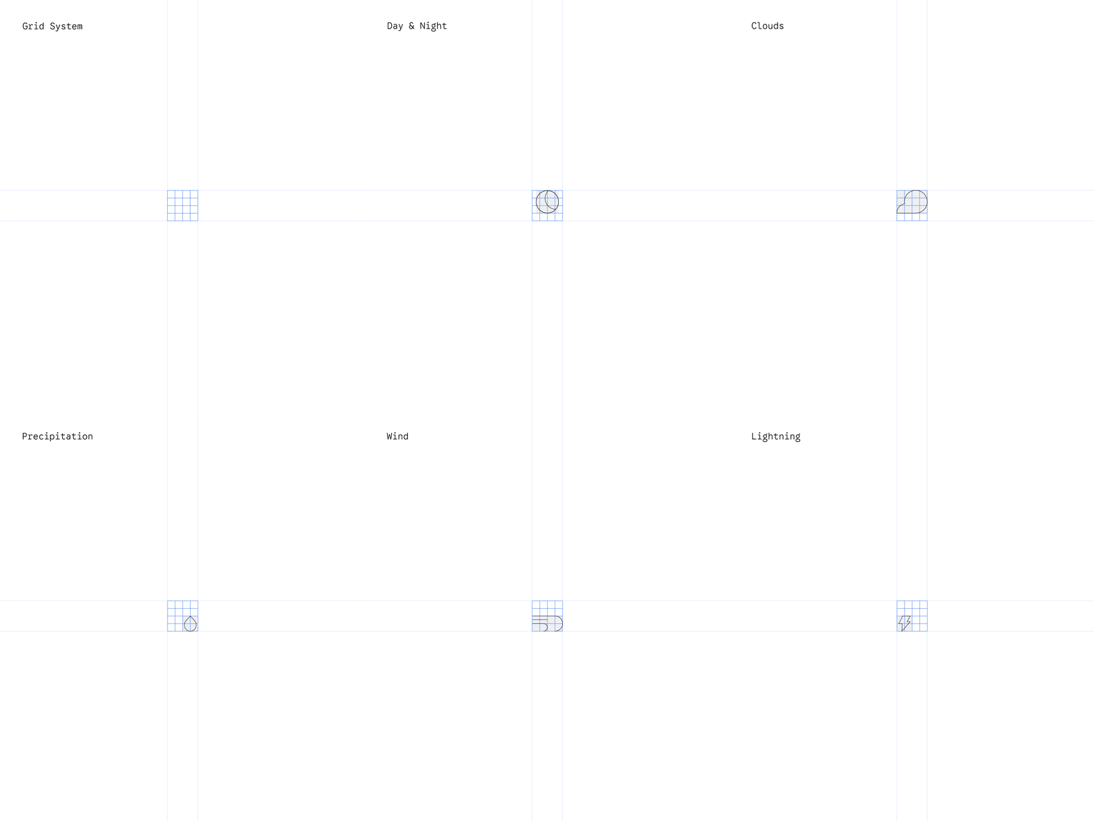
Concepting
Explored multiple directions and tested them across real use cases. Complex icons failed at small sizes — fast. That sent us the other way: strip the decoration, keep only the shapes people need to recognize a condition instantly. Function over form.


Solution
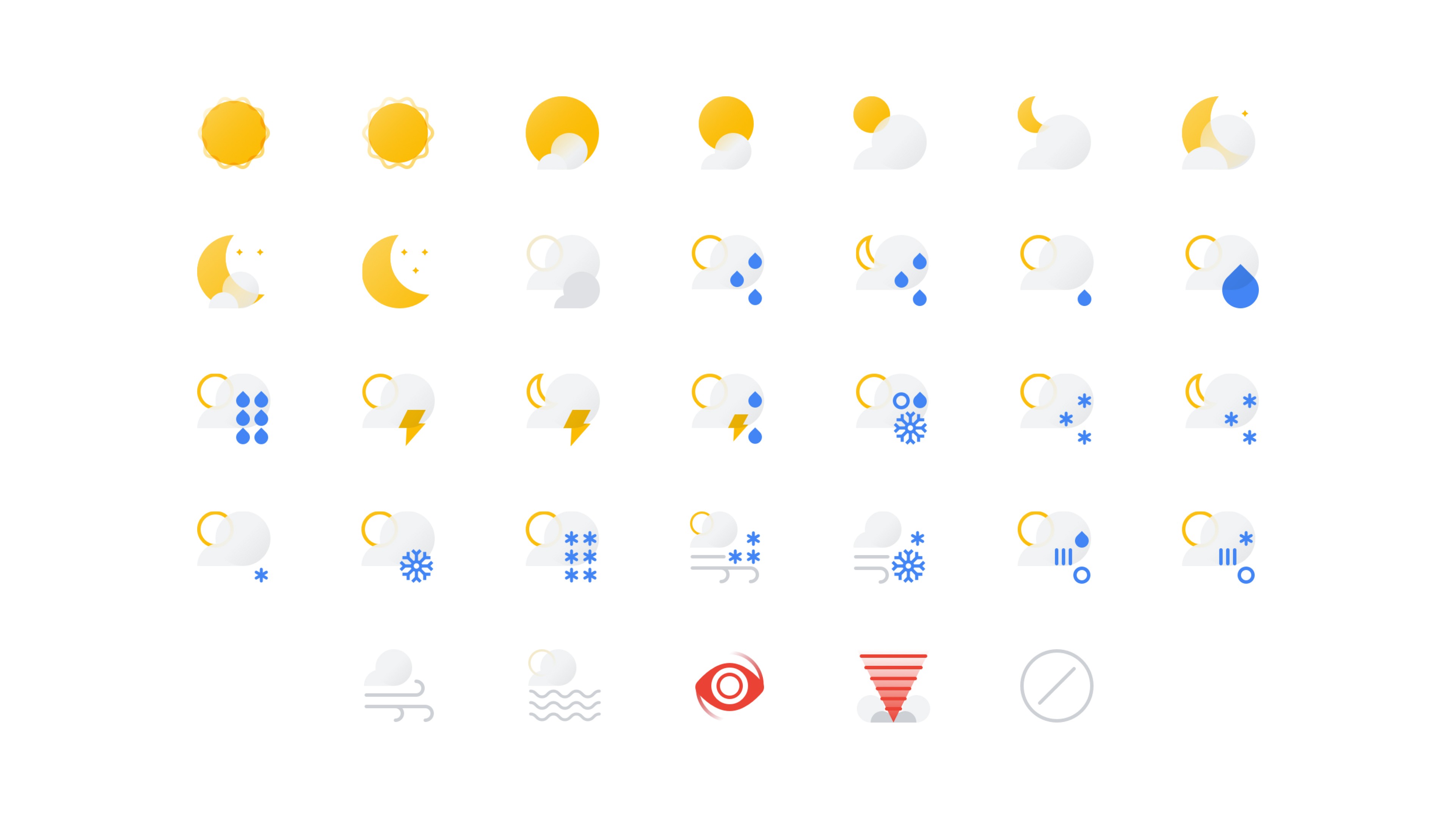
33 icons. Reduced to essentials, built to scale. Works across every platform, condition, and size — small mobile through large display. Full light and dark mode support.


First Application
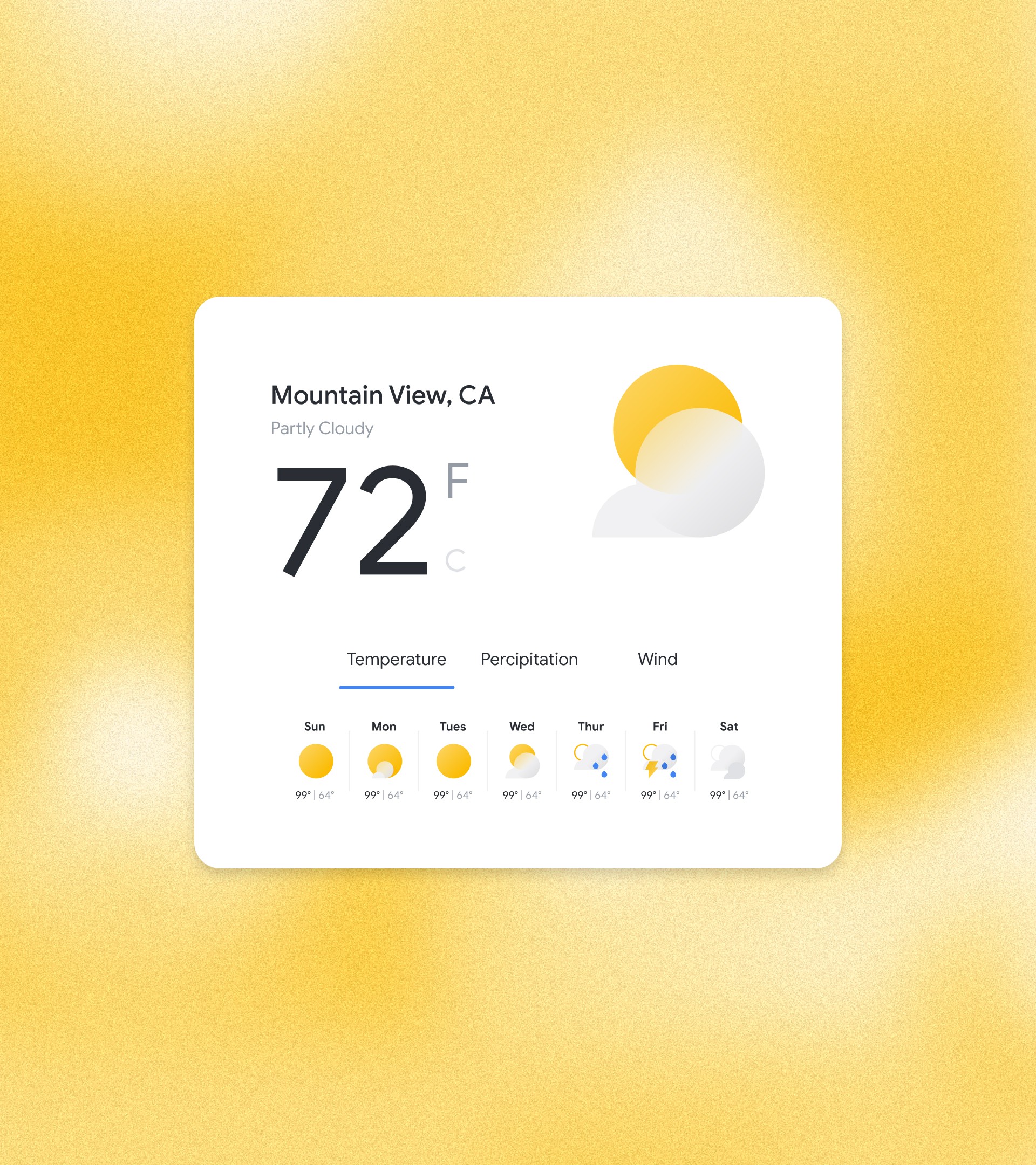
Google News was the first product we could apply the system to, and the first place it met a real product surface.
Icons that read fine in isolation had to hold up in a dense feed, at a glance, against headlines competing for attention. That pushed us to tighten contrast and simplify a handful of conditions further than planned.
The system that came out of News was smaller and clearer than the one that went in — and those learnings went straight into the documentation.

Driving Adoption
Internal toolkits. Workshops with cross-functional teams across regions. Design specs, usage guidelines, and implementation support.
Documentation captured the key learnings from building the system — which is what let other teams take it further without starting over.


Outcomes
Live across News, Material, Maps, Assistant, Android, and more
Reaching 3 billion users monthly
Reduced icon production time through systematic, scalable design
Established consistent weather communication across all Google products
Key Contributors
Creative Director
Lead Designer