Mixpanel Rebrand
We rebuilt Mixpanel's brand around the builders, not the dashboards.

Project Overview
Mixpanel is a product analytics platform that tells companies what users actually did — not how many people showed up. After a $200M Series C and two years of heavy product investment, we hit an inflection point: competitors were copying every feature we shipped. The brand was still built for a point analytics tool while the business was heading somewhere much bigger.

Identity
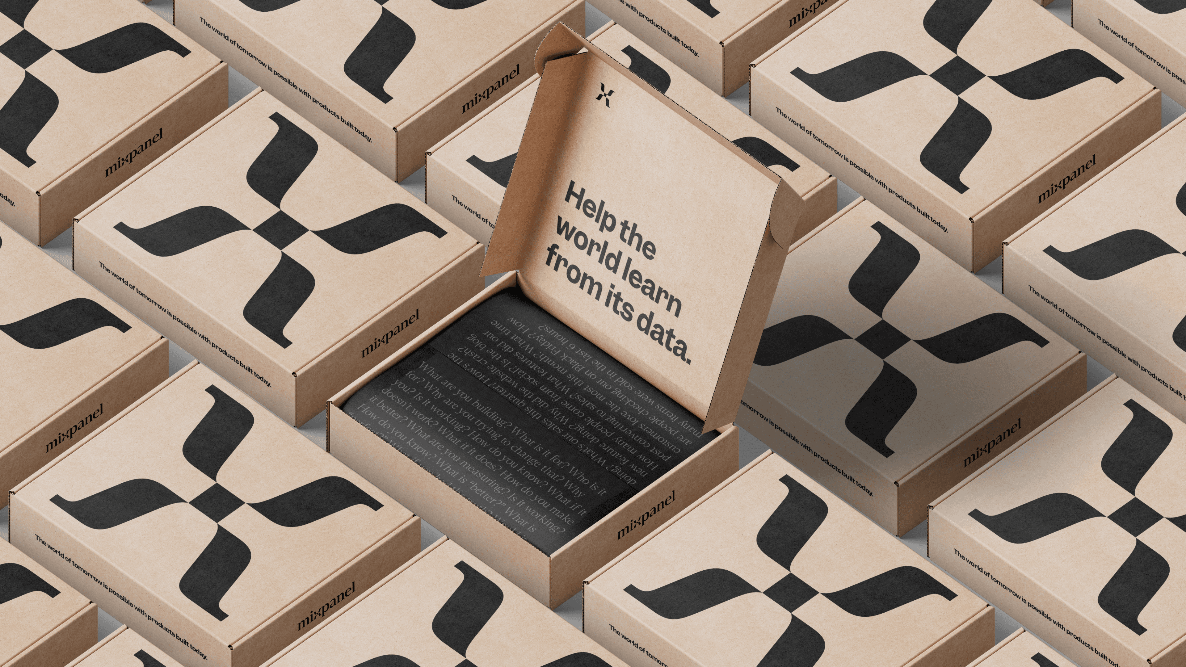
The three-dot mark started as a funnel — data in, insight out. It said nothing about where the company was going. We turned it into a journey: dotted waypoints on a map, an X marking the destination. Same shape, different meaning, and much closer to what the product actually does.




The System
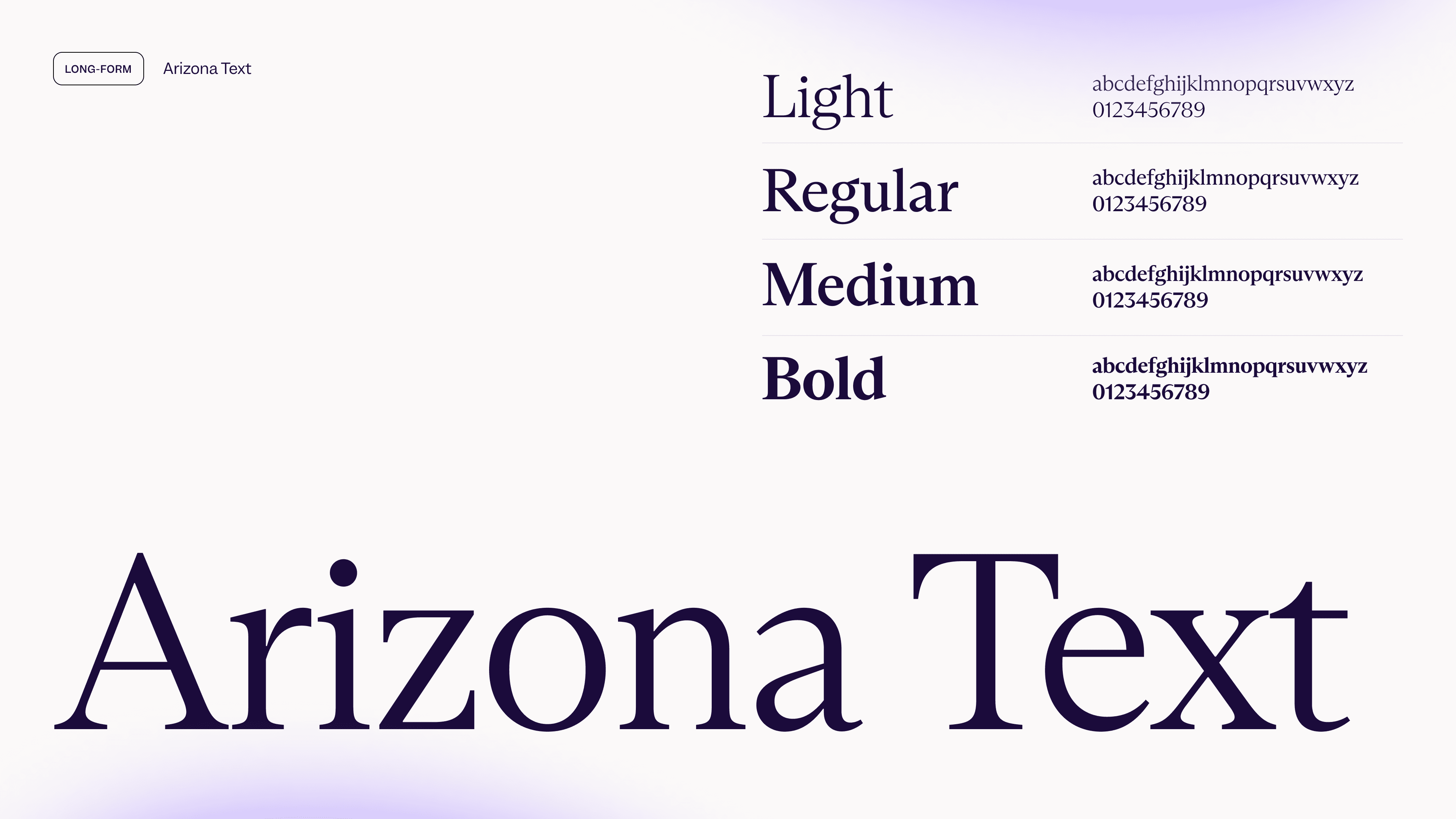
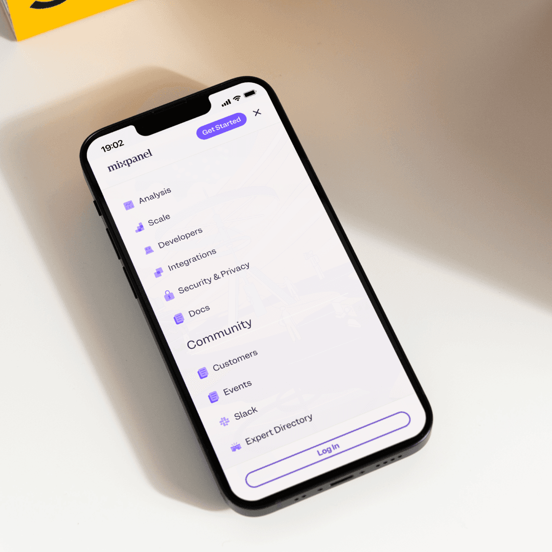
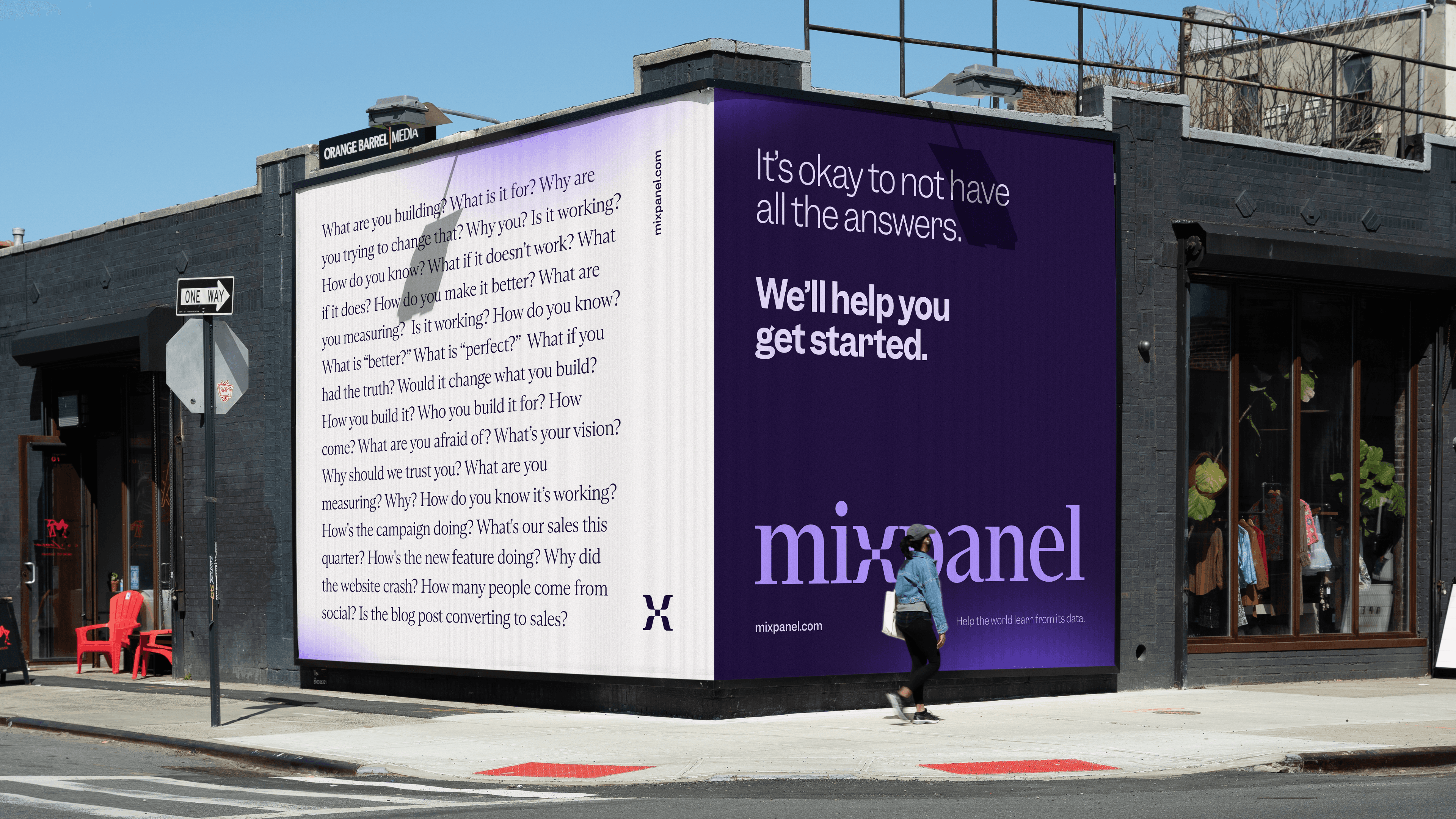
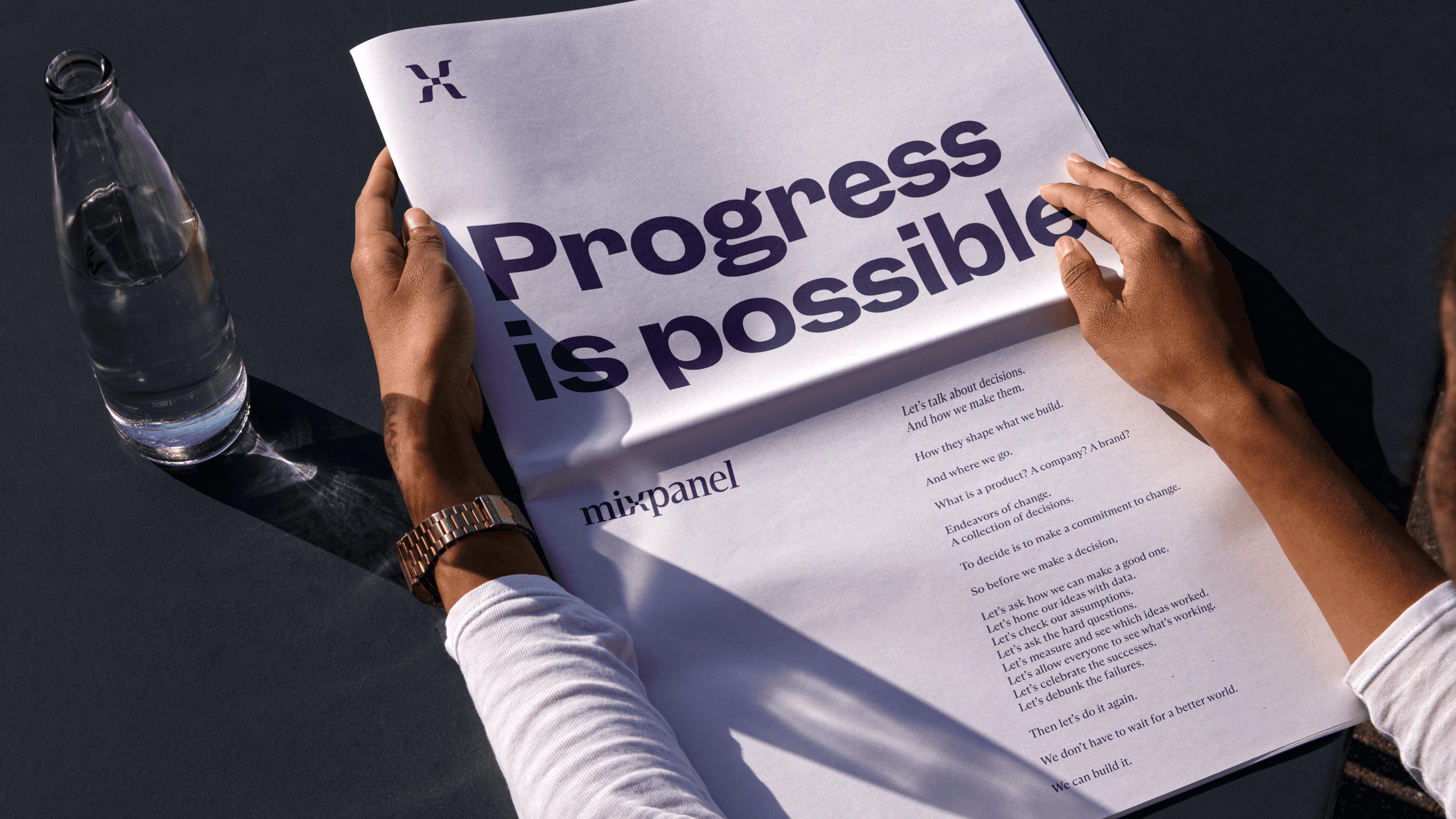
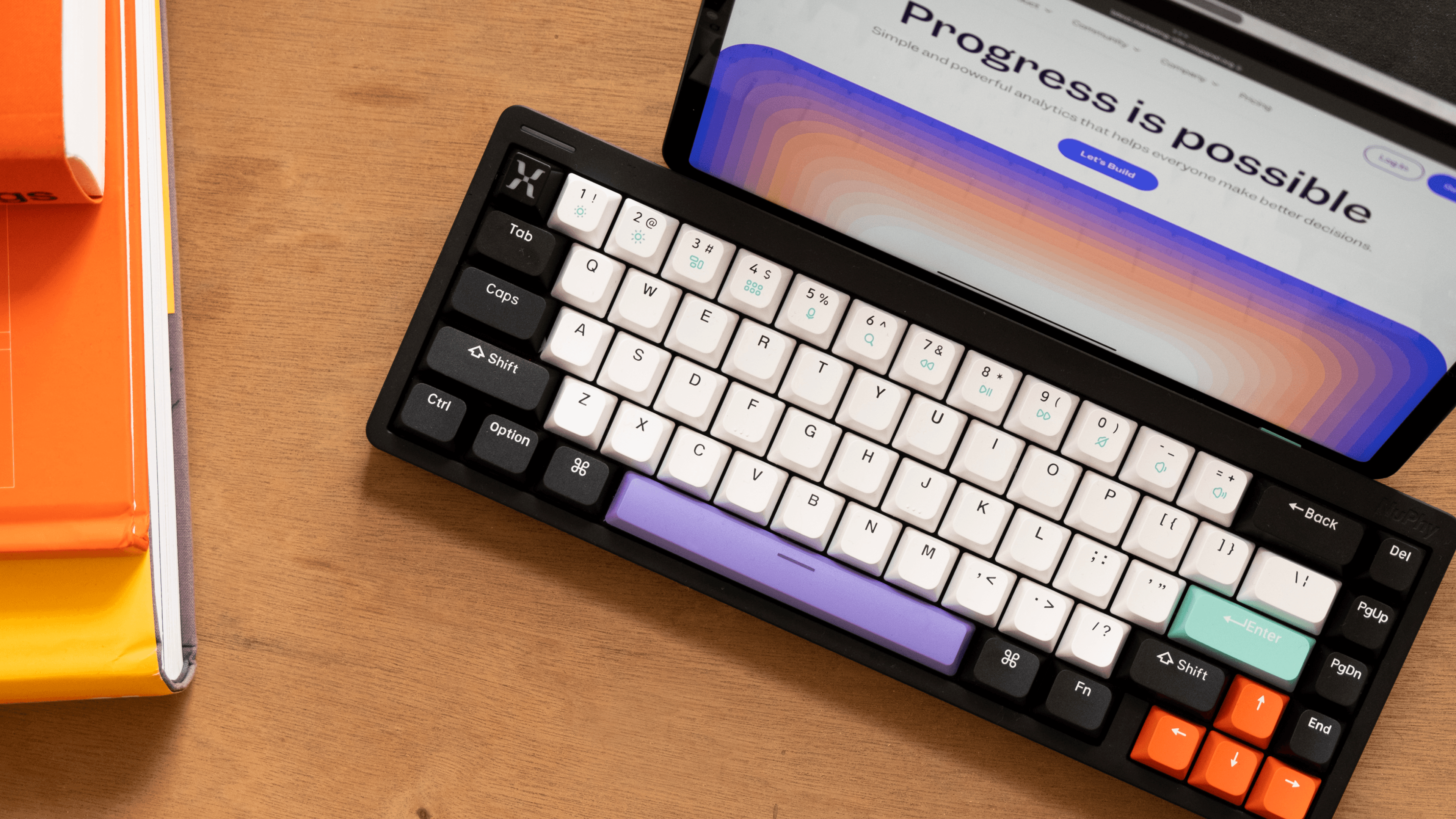
Everything downstream followed that logic. "Earth+," an illustration world where products are portals to possibility. A graphic language that gives shape to invisible event data. Color expanded for accessibility and range. Typography that stands apart in a category that all looks the same. And a voice built for builders — honest and encouraging, not a feature list.














Role
Paul Jun led brand strategy and story. I co-led everything downstream of it — creative direction, identity, web, in-product, campaign — turning a position into a system people could actually use. How it came to life, we figured out together.
Alongside that: scaling the team from 2 to 8, concepting hands-on with them, and building the systems — leveling, process, craft standards — that let the work scale past me.
Key Contributors
Head of Brand Design
Principal Creative Director
Principal Product Designer
Principal Brand Designer
Staff Motion Designer
Staff Interactive Designer
Staff Campaign Designer
Sr. Brand Designer
Sr. Brand Designer
Contractor: Brand & Identity Design
Contractor: Brand System Scaling
Contractor: Final Logo Type